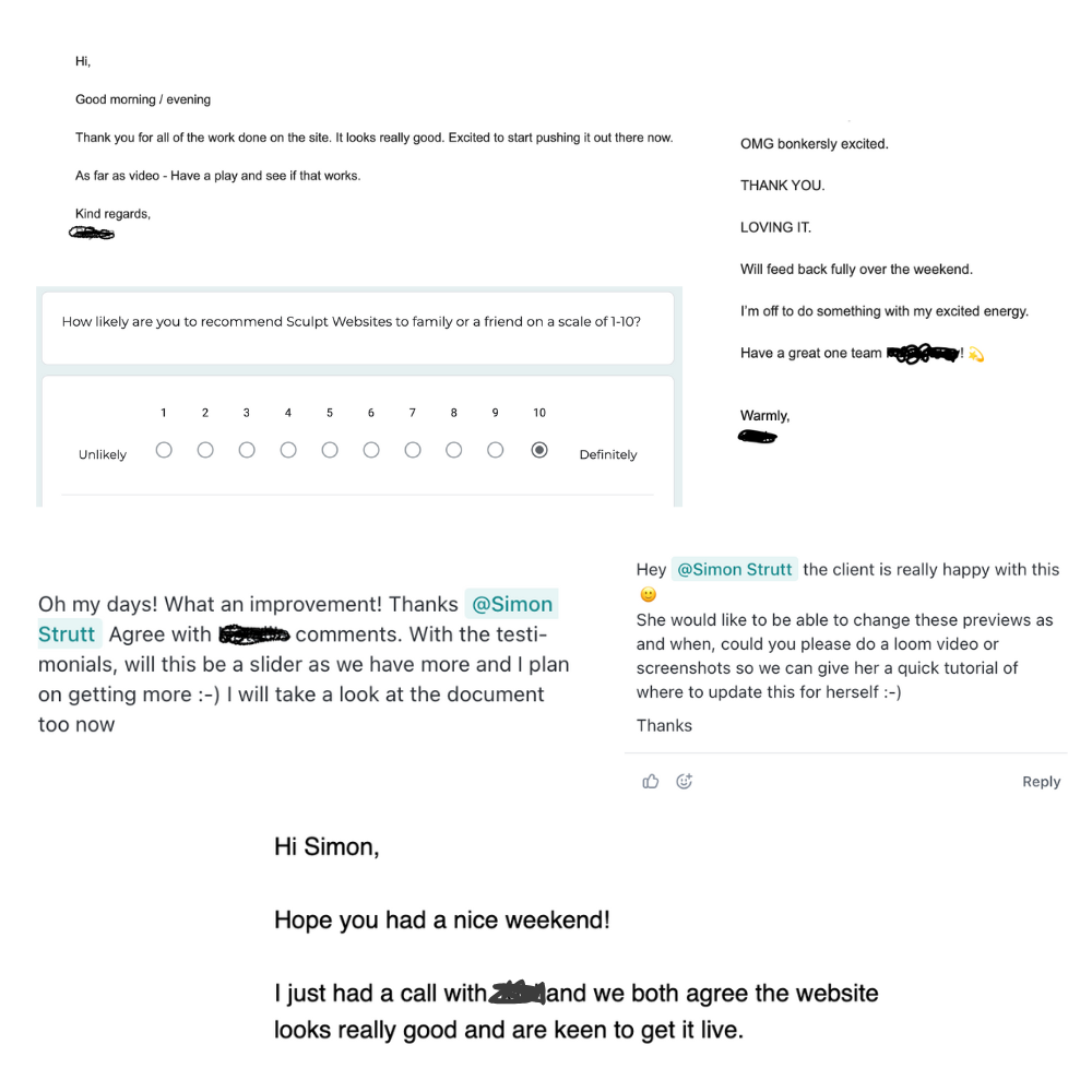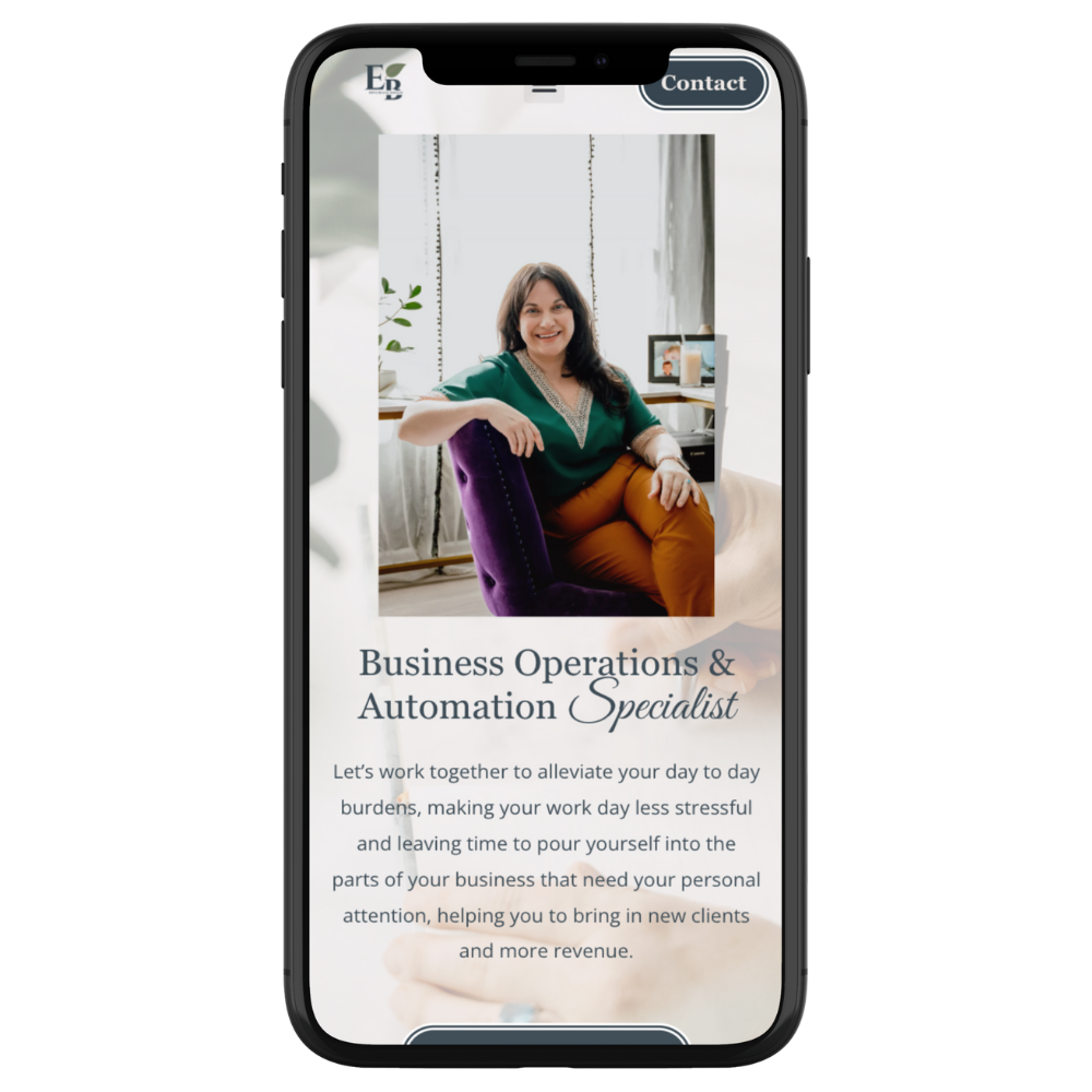
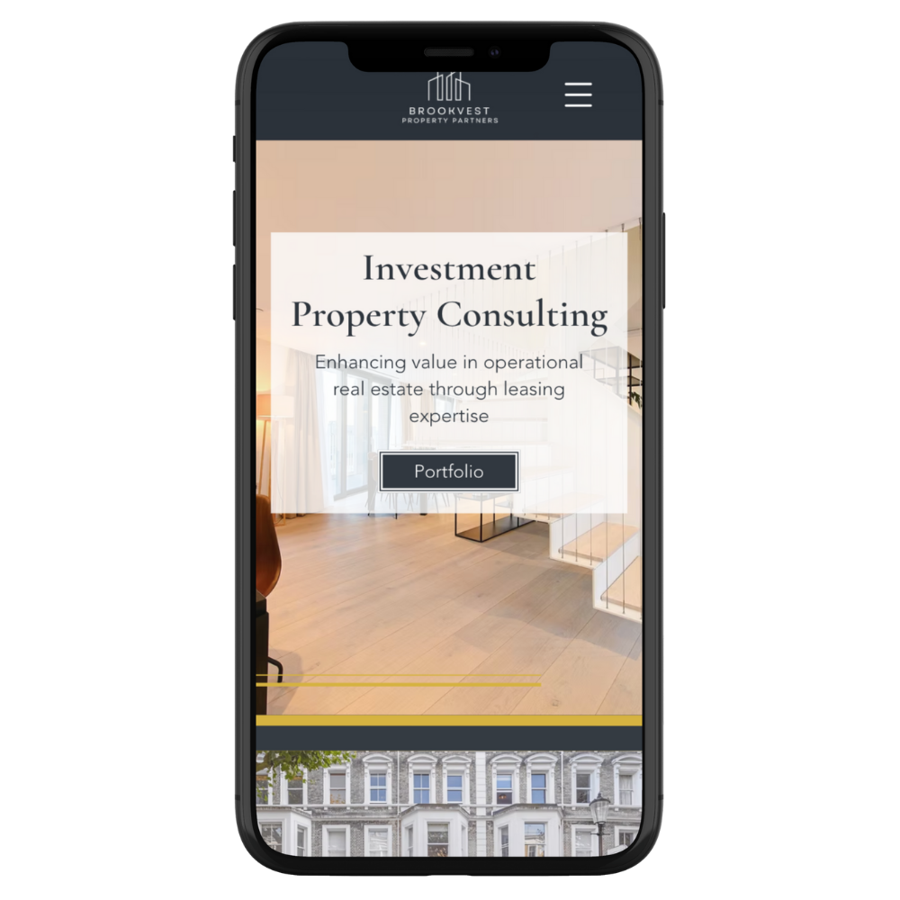
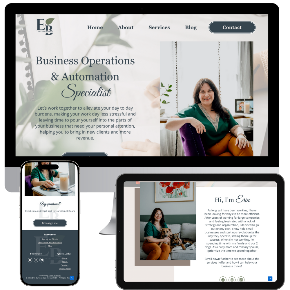
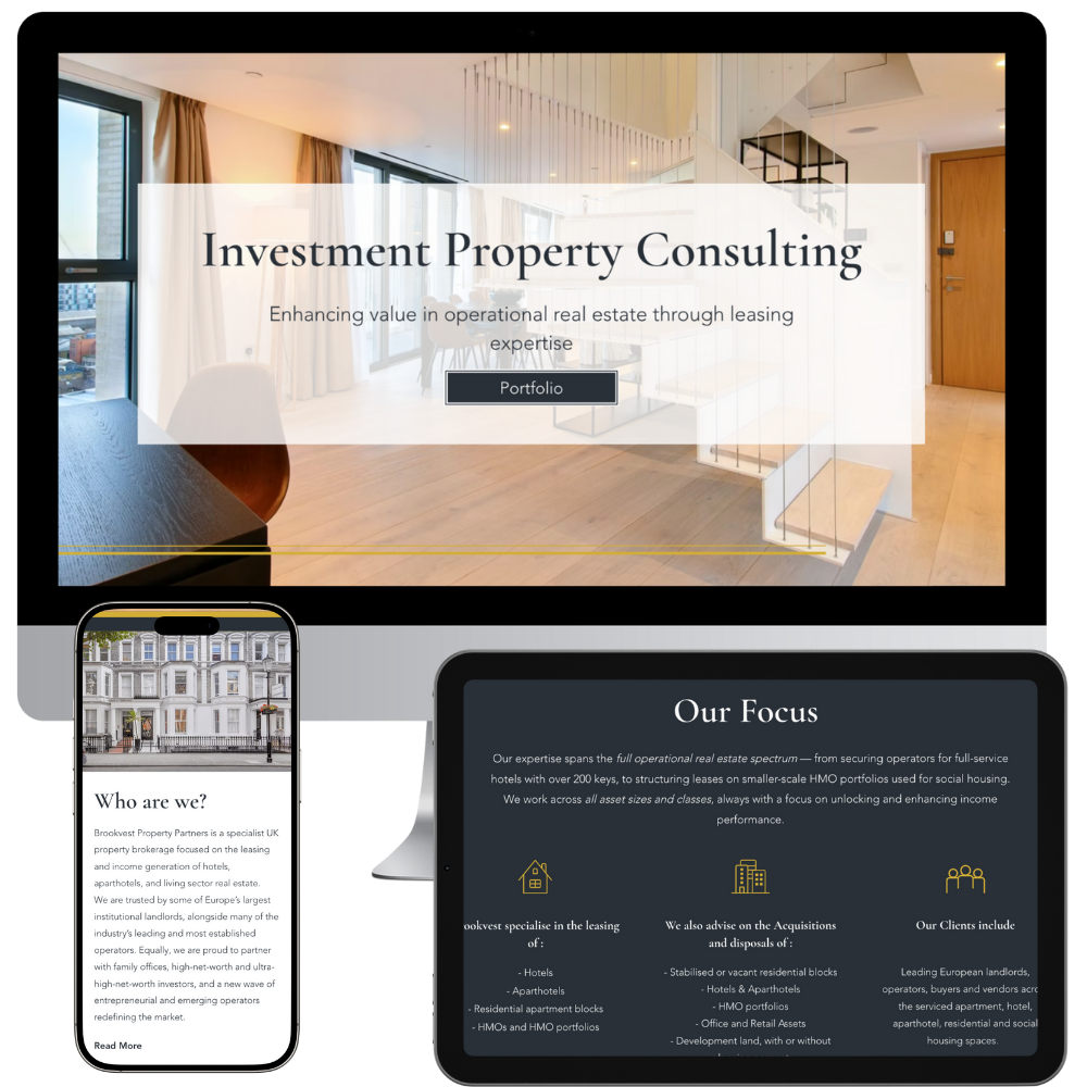
"Simon made the entire process easy from start to finish. He handled all the details and incorporated all of my requests while adding in details I hadn't even thought of. He developed a design that is reflective of my personality and business and executed it in a timely manner. Communicating with Simon was easy and he is always quick to respond. I am beyond happy with the outcome!"
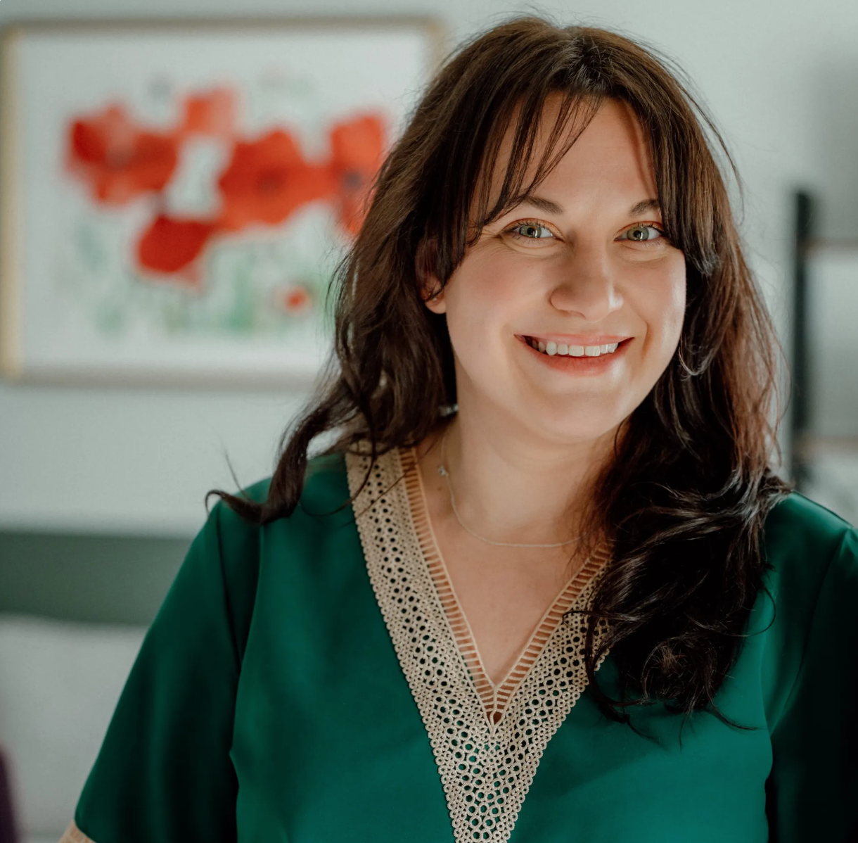
Erin Burns
Erin Burns VA
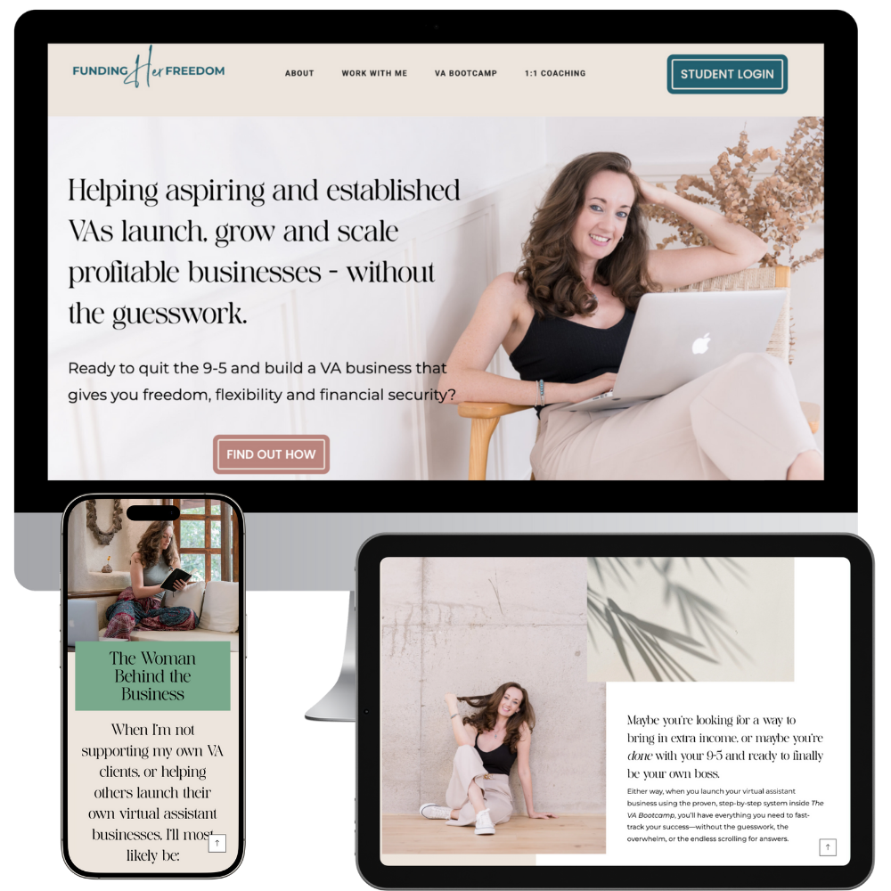
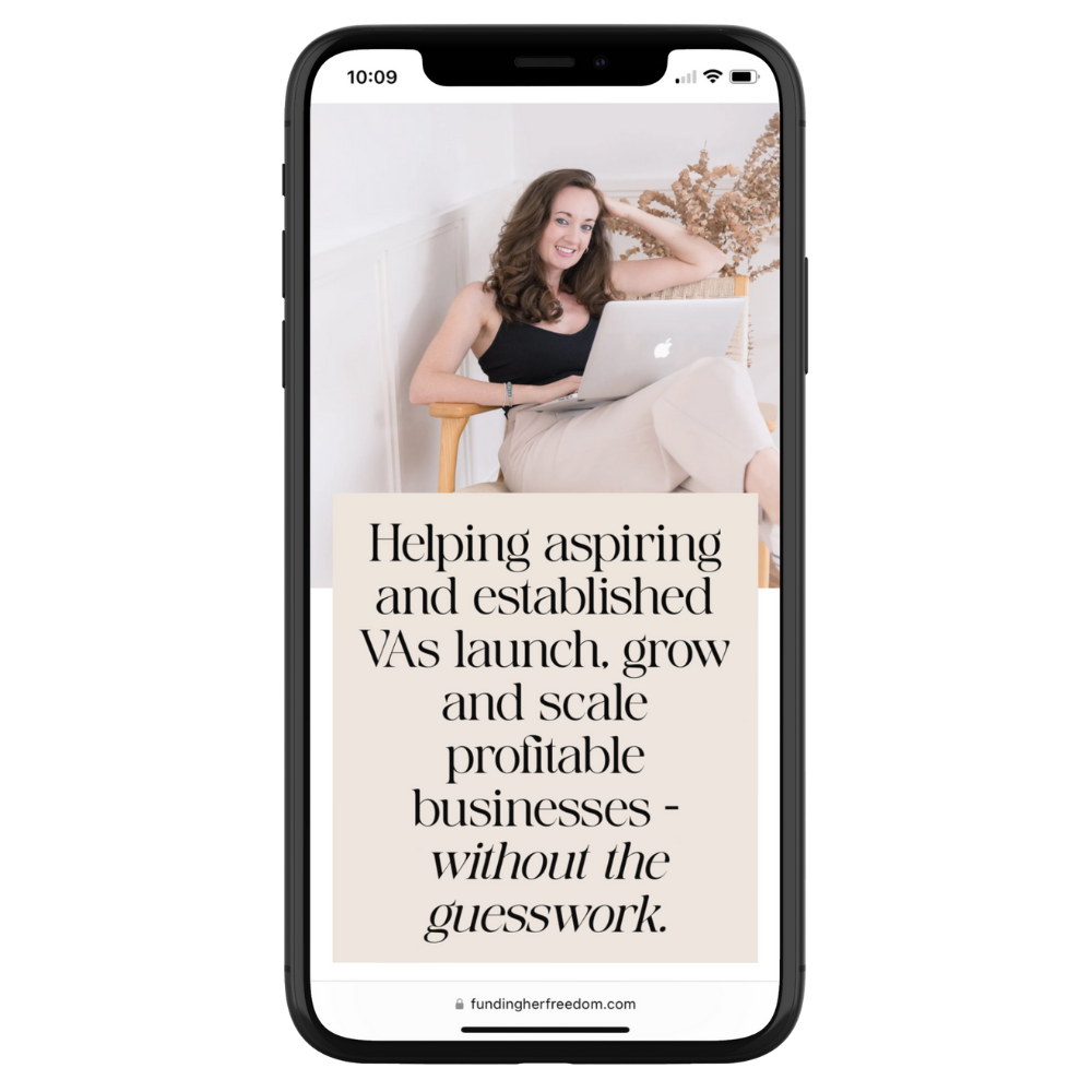
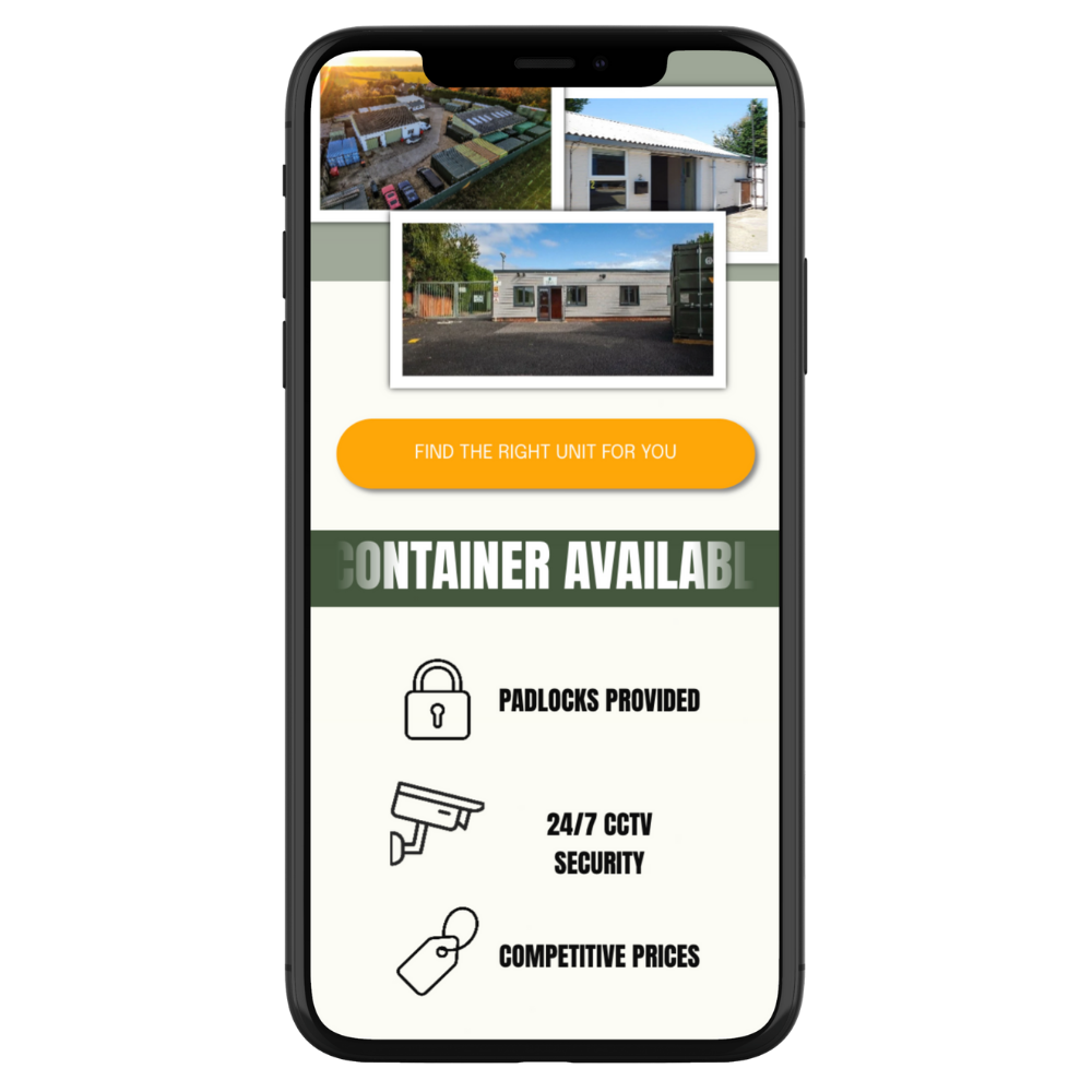
"Working with Si was easy - he took the time to understand my business aims, and helped guide me with suggestions and recommendations for creating a website that would result in better reach and conversions. I loved the design he came up with, and he truly understood my target audience to create something that would stand out to them.
So much so, I’ve just had the highest number of sign-ups to my group programme yet - and I truly believe the website played a large part in this!
I wouldn’t hesitate to recommend working with Si - and I look forward to having him work on my other websites soon."
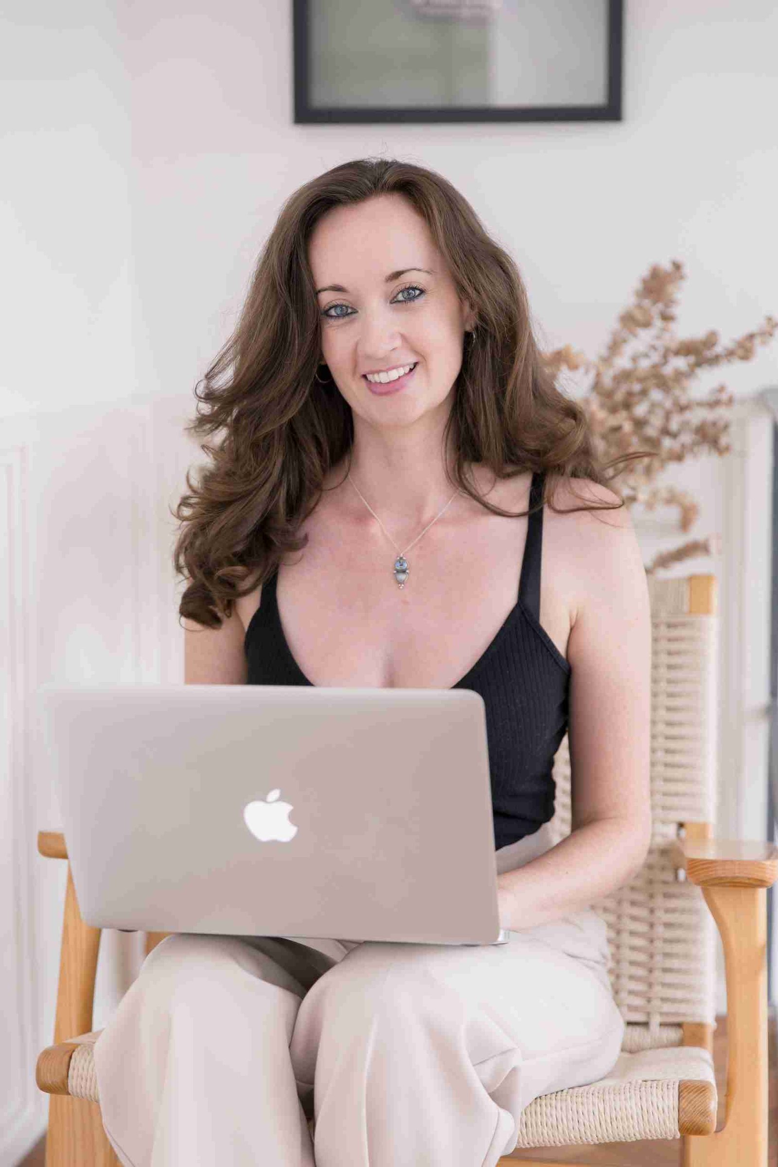
Steph Punfield
Funding Her Freedom
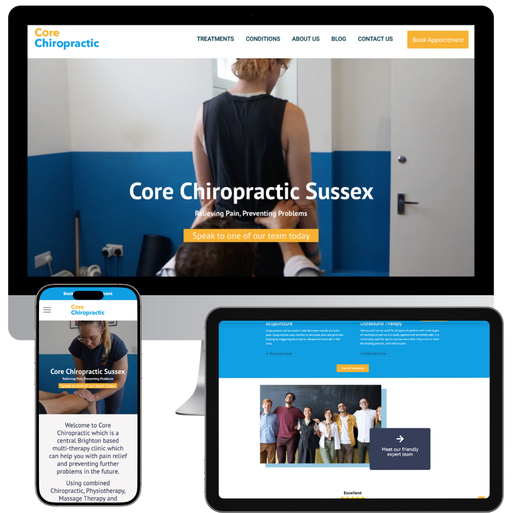
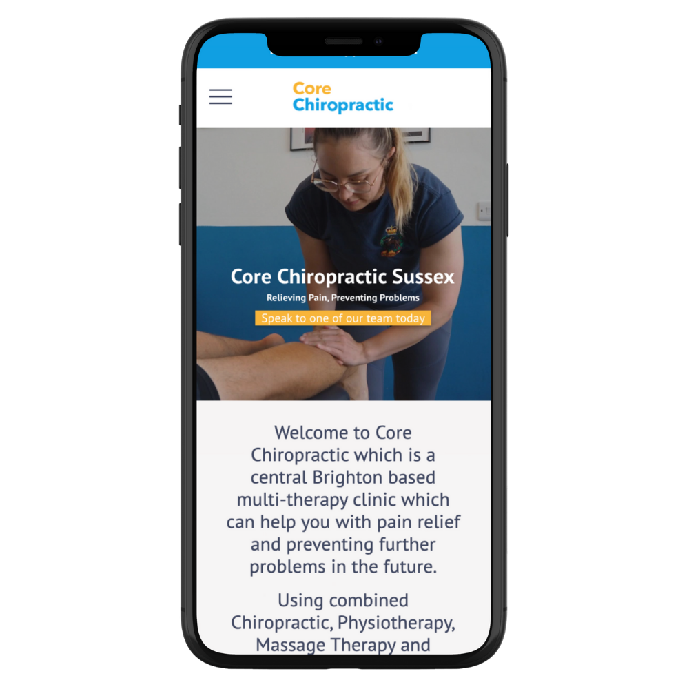
“Working with Simon and Sculpt was a great experience and I feel he created a great product. He had insider knowledge into the health and wellness industry yet to POV of a consumer which helped create direction for what we were trying to achieve. I'm very happy with the final product and the brand refresh. His skills are good and I would thoroughly recommend working with him”
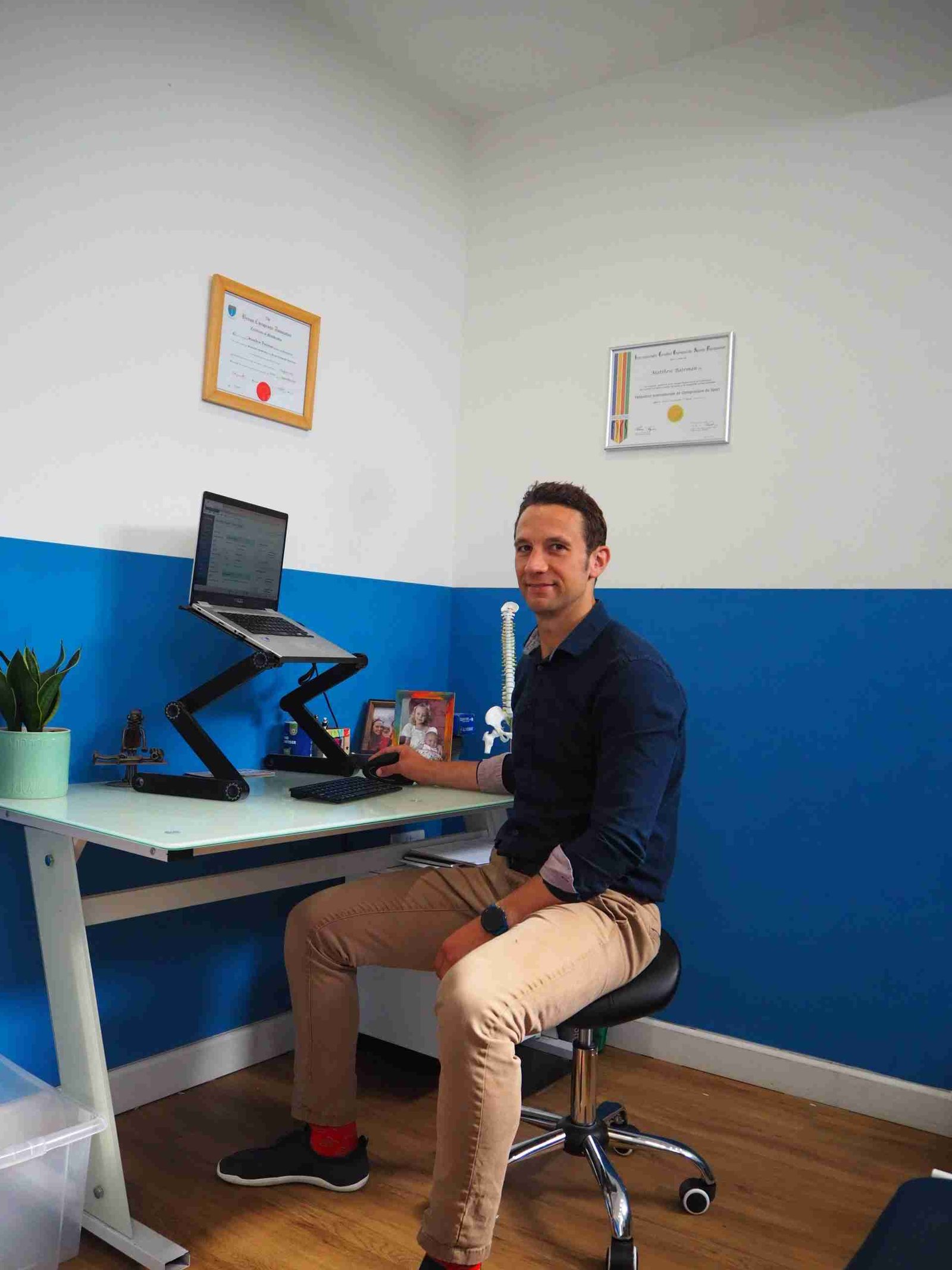
Matthew Bateman
CC Sussex
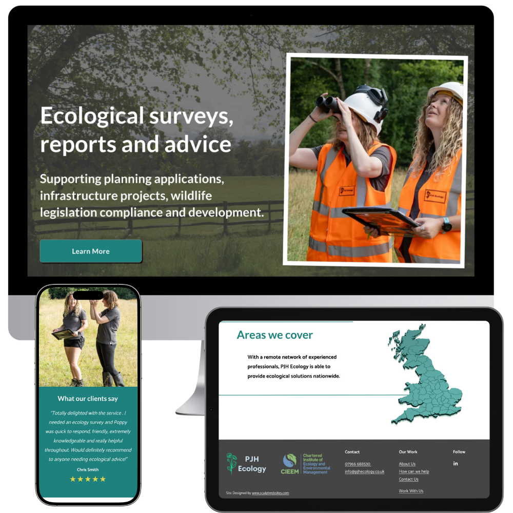
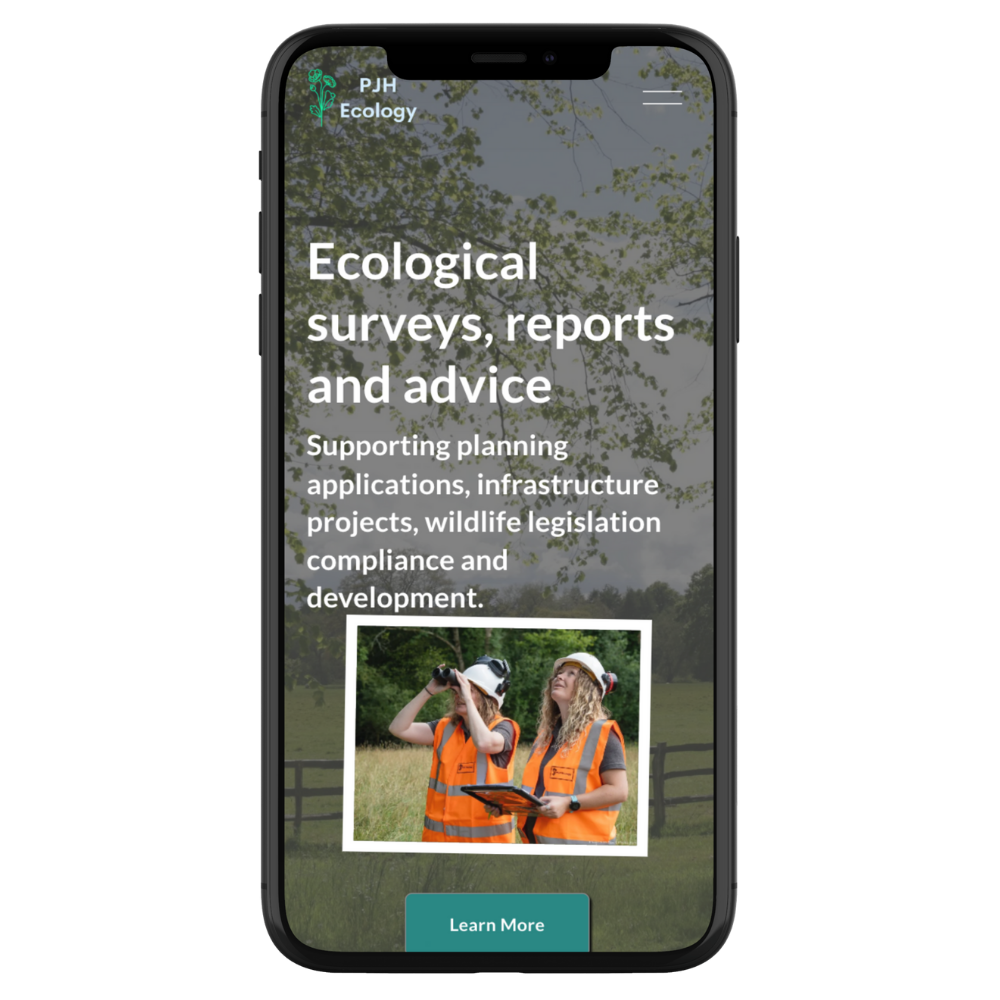
"I’m so pleased with my new website! Communication was excellent throughout, I really valued the style, advice and research that went into the design. The end result is a site I absolutely love."
Poppy Hookings
PJH Ecology